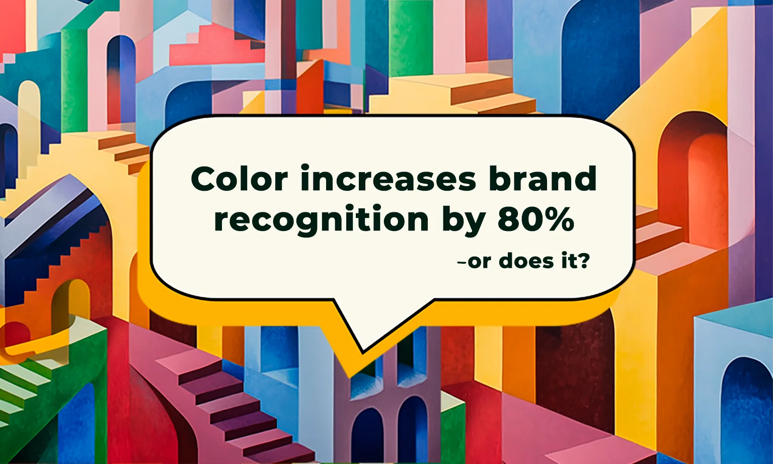
The Mythical Color Increases Brand Recognition Statistic
In the world of marketing, few things are as enticing as a statistic that seems to perfectly encapsulate the power of a single element—like color. Enter the legendary claim: “Color increases brand recognition by 80%,” typically attributed to Dr. Ellen Hoadley of Loyola University Maryland. It’s a statistic so often quoted that it has become marketing lore. A Google search shows it regularly quoted over at least the past 12 years. However, the reality is that tracking down the origins of this number is like navigating a maze.
Seeing how widely shared this statistic is makes it worth going down a rabbit hole to uncover its true origins and see if it ties into something as seemingly simple as your star rating color.
The Magic of Color in Consumer Perception
Color isn’t just about aesthetics—it’s about emotion, psychology, and influence. The color of star ratings on your reviews can shape how potential customers perceive your business. Yellow stars might conjure feelings of cheerfulness, while blue stars suggest reliability and professionalism. But how do you decide which color to use? Is there really an 80% boost in recognition just waiting for you at the end of the rainbow?
This is where the legendary statistic comes into play, or rather, where the legend starts to unravel.
The Myth of the 80% Statistic: A Wild Goose Chase
So, where did the “color increases brand recognition by 80%” statistic come from? Despite its frequent appearance in marketing guides, the origin of this number isn’t simple. According to insights4print, this statistic is often misquoted and taken out of context. A more accurate version of the quote could be: “Color increases brand recognition by up to 80%, compared to monochrome.” This figure from Dr. Hoadley’s research originally referred to how color enhances information processing in documents and graphs, not specifically branding alone. In 1990, when Dr. Hoadley started her research, the use of color in documents was still costly and rare.
This doesn’t mean that color isn’t important—far from it. It just means we need to separate fact from fiction, especially when making decisions that impact your brand’s image.
Choosing the Right Star Color: No Magic Numbers, Just Smart Choices
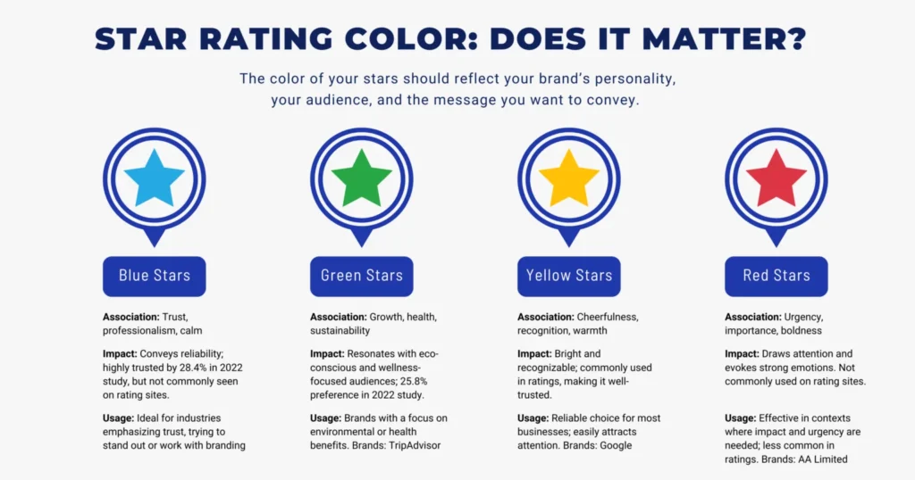
Now that we’ve debunked the 80% myth let’s explore what this means for your star ratings. While there’s no magic number to guide you, making informed choices based on real consumer behavior can be highly beneficial. Our 2015 and 2022 studies on star rating colors revealed that blue stars lead in trustworthiness, though green and yellow also hold significant value. Here’s a breakdown of how different colors can impact consumer perceptions and engagement:
Blue Stars: If you want to convey trust and professionalism, blue might be your best option. It exudes calm and reliability—ideal for industries where trust is crucial. Our 2022 study showed that 28.4% of participants trusted blue stars the most. Despite their high rating in our survey, blue stars are less commonly used in rating systems, which might make them stand out and help convey a sense of uniqueness and reliability.
Green Stars: Green symbolizes growth, health, and sustainability. If your brand focuses on eco-consciousness or wellness, green stars might resonate well with your audience, as 25.8% of participants preferred them in our study. TripAdvisor’s green dots are a great example of using color and shape to align with brand identity.
Yellow Stars: The classic choice. Yellow is bright, cheerful, and easily recognized as a star-rating color. It’s also well-trusted, perhaps because many review sites, like Google, use yellow. It’s a reliable choice for most businesses.
Red Stars: Red is bold and attention-grabbing, often associated with urgency or importance. While not commonly used for ratings, it can be powerful in contexts where you want to evoke strong emotions or connect with your brand, as demonstrated by AA Limited’s ‘Red Star’ awards for the best hotels in the UK.
The key takeaway? The color of your stars should reflect your brand’s personality, your audience, and the message you want to convey. Focus on data-driven insights and consumer preferences to choose the color that best aligns with your brand and audience.
Conclusion: Embrace the Facts, Not the Fantasy
The journey to uncover the truth behind the 80% color statistic is a reminder that not all that glitters is gold. While color undoubtedly plays a significant role in branding, its impact should be viewed through research and consumer insights, not misunderstood, misquoted numbers.
So, when you choose the color of your review stars, do so with a clear understanding of the facts. Focus on making informed, strategic choices that align with your brand’s identity and audience. In reputation management, it’s the real, data-driven decisions that drive success.
Ready to explore smart review strategies? Get in touch with us, and let’s strategize about your business’s reputation—based on actual facts and insights.